Objective
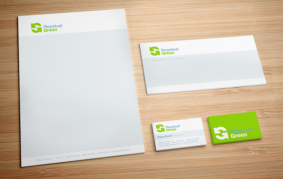
Create a logo and visual identity for a company specializing in green, energy-saving products for the home.
Solution
The logomark uses iconic recycle arrows to form a “G”. Designed to be 100% symmetrical, the “G” – a symbol for Green – is constantly in motion. If you rotate the logo 180-degrees and view it upside down, it will read the same.